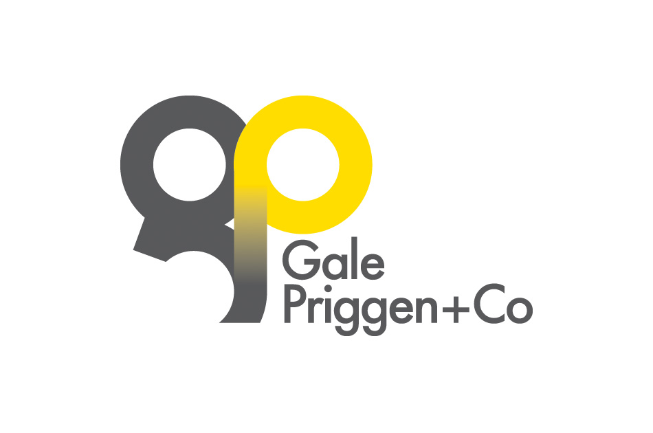
Gale Priggen + Co
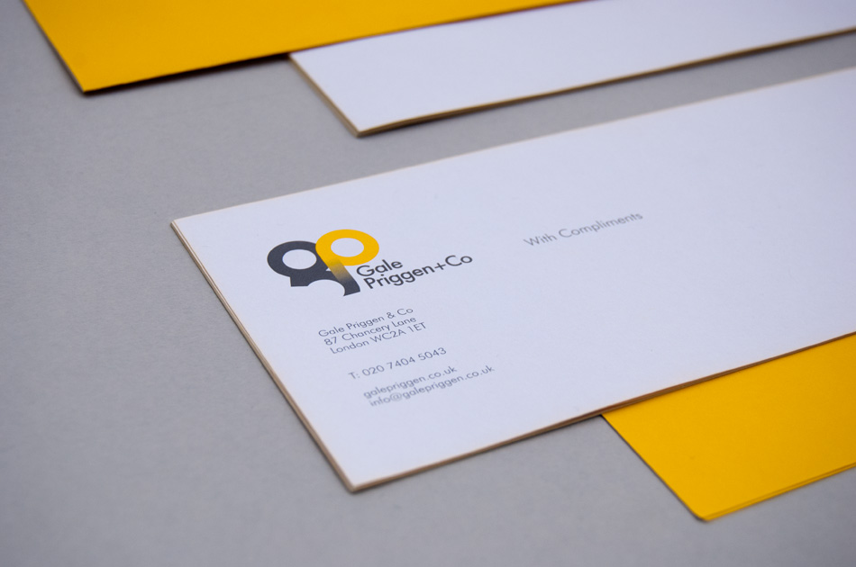
Gale Priggen & Co is a partnership established in 1991, which specializes in all aspects of commercial property, principally in the mid city area.
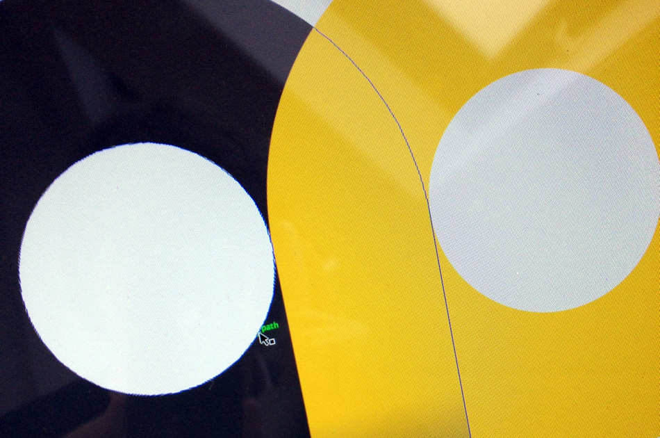
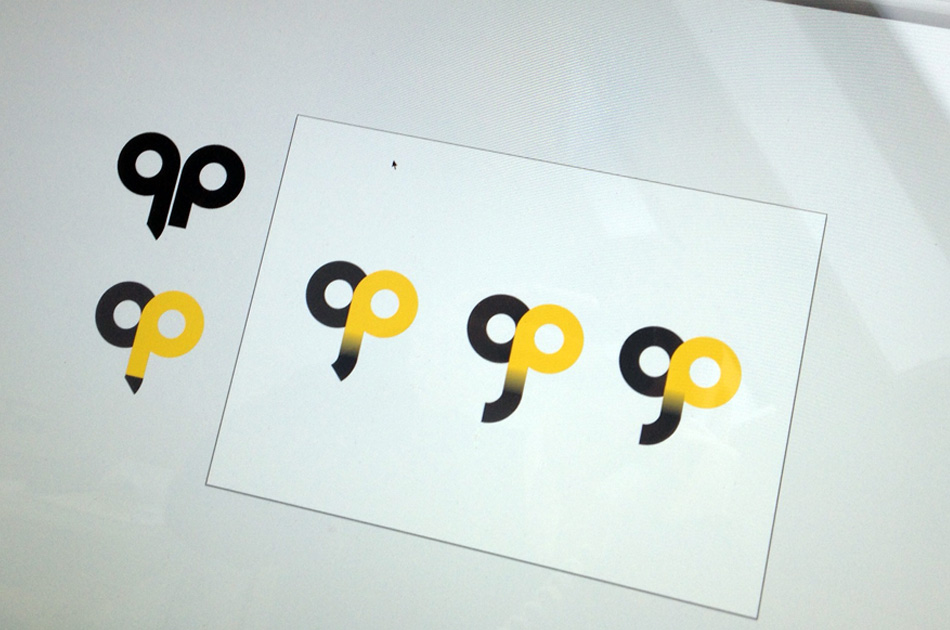
When looking to rebrand, they came to us (work undertaken whilst co-director at The Design Conspiracy). Their only insistence in the brief was to retain the linking G and P from their original identity, not two characters that naturally sit well together. Searching old type catalogues we came across the Kabel typeface with its cut ‘G’ this formed the basis of the linking characters. After several re-workings we got one that worked.
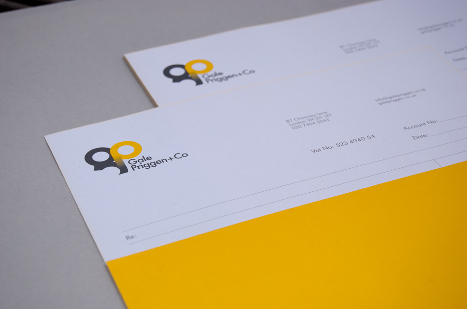
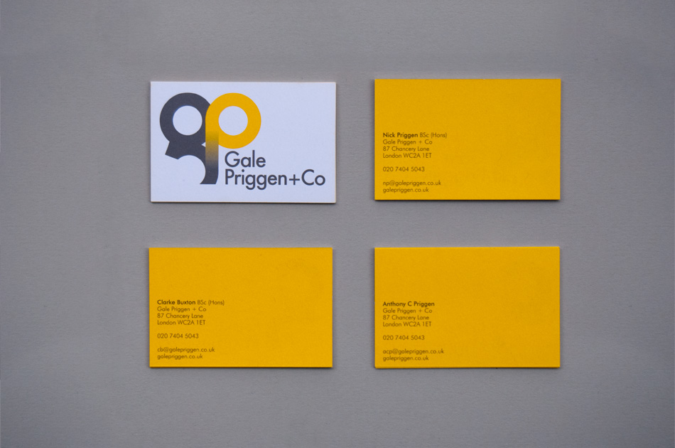
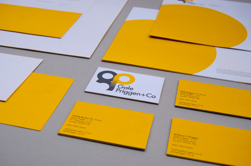
This fresh and modern identity has been applied across stationery with a full flood yellow back, website, Twitter and of course the all important estate agents’ board giving Gale Priggen a totally new look.